YETI · Gear Locker
A digital layer for a physical brand.
Designing a home for YETI owners’ gear, where registering a product is the start of a long-term relationship with the brand.
- Client
- YETI, via Code & Theory
- My role
- Product Designer, led the initiative
- Team
- 1 PM · 1 visual/UI designer · 1 experience designer · 5 engineers
- Timeline
- Oct – Dec 2024
- Platforms
- Web & mobile web
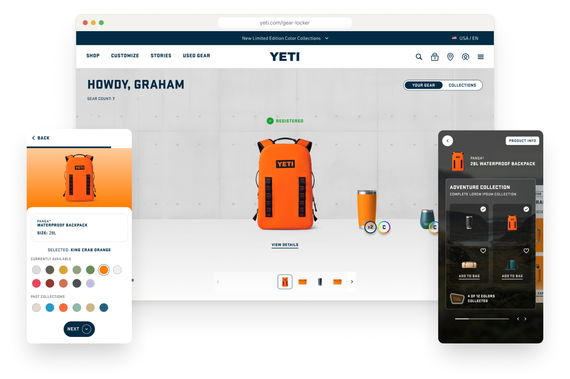
01Context
Strong in the real world, thin online.
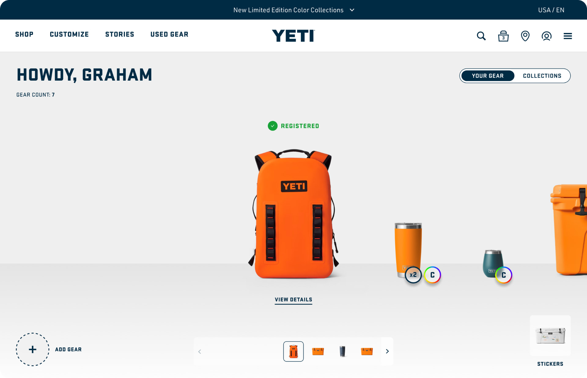
YETI is a premium outdoor brand known for long-lasting products and a strong real-world community. But beyond e-commerce, customer support and warranty service, it had very few digital touch points: once someone bought a cooler, the relationship went quiet.
For owners
There was no place to keep track of the products they own or to reach care and support for them.
For YETI
No reliable ownership signals to understand how products are used and how people engage over time.
The core challenge
How might we create a digital experience that adds real value to ownership, while helping YETI build a more informed, long-term relationship with its users?
02Research
What makes people come back to a brand they already own?
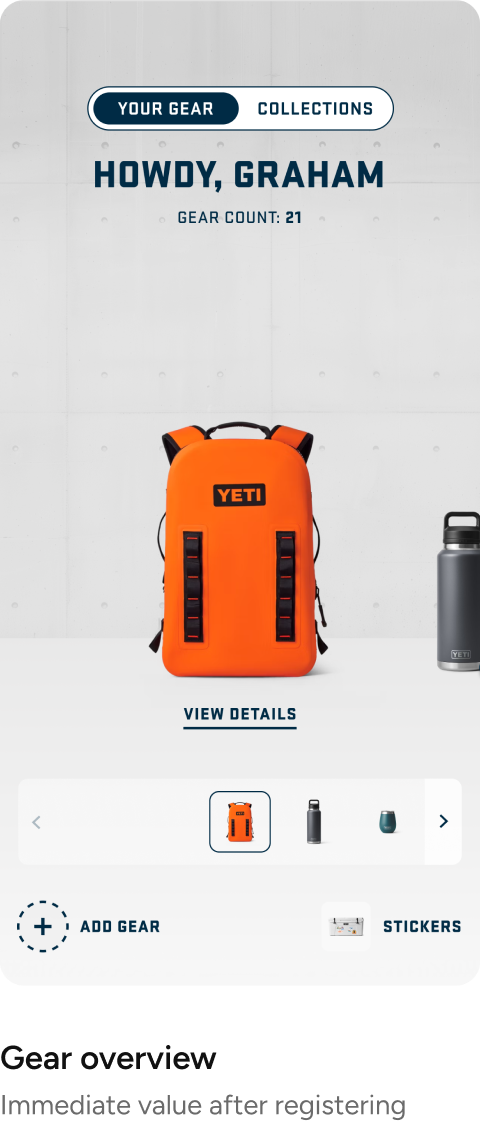
We benchmarked 8 brands: Sephora, Adidas, Strava, Klarna, Whering, Peloton, Tesla and Nike, looking at how they keep customers engaged after the purchase. Three patterns kept showing up: a sense of belonging (Sephora, Strava), rewards for participating (Adidas, Strava), and a dashboard of what you own (Whering). Seeing your things in one place changes how you use them.
Experience themes
- Playful
- Engaging
- Exploratory
- Fresh
01 · A place for what you own
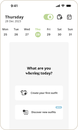
- Whering: A digital inventory of your wardrobe to see, organize and rediscover what you already own.
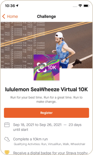
- Strava: Personal goals and progress tracking that give people a reason to come back.
- For Gear Locker: Became the core of the MVP: the Gear overview.
02 · Rewards for showing up
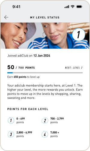
- Adidas: Members are rewarded for engagement and purchases, with early access to drops.
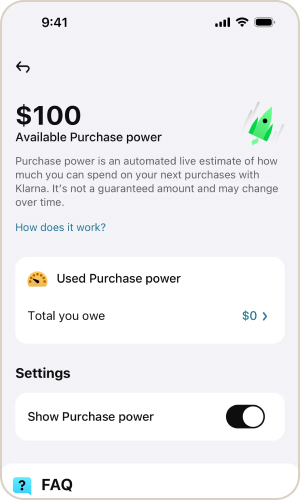
- Klarna: Milestones and challenges that unlock rewards.
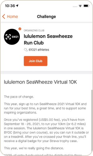
- Strava: Challenges that earn digital badges.
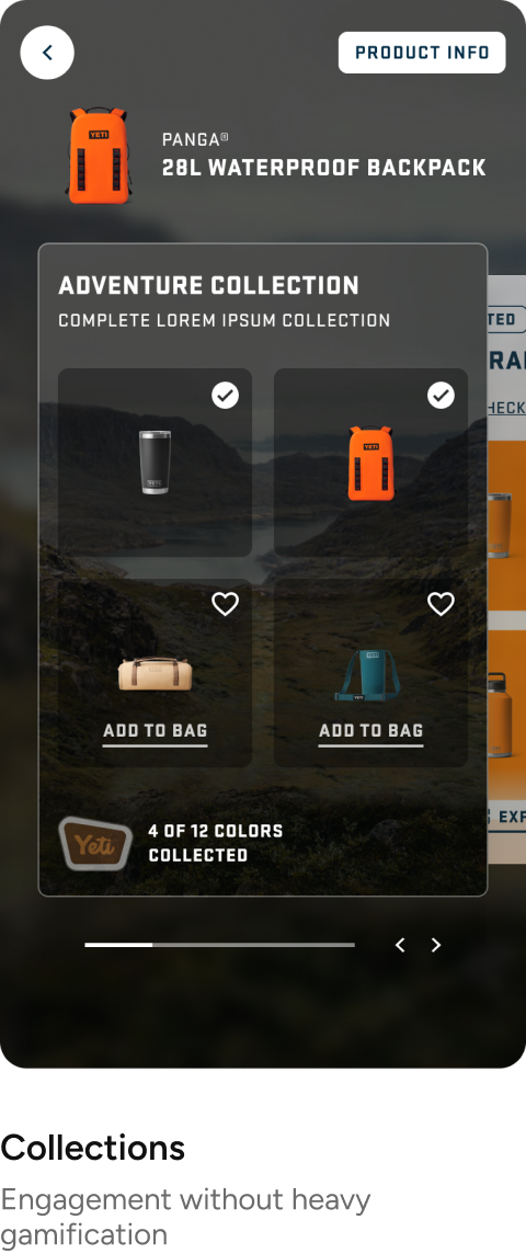
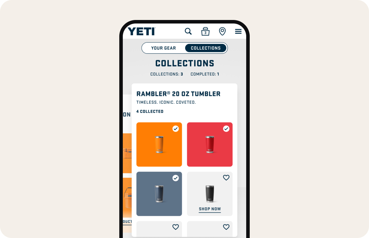
- For Gear Locker: Explored as stickers and collections, kept light in the MVP.
03 · A sense of belonging
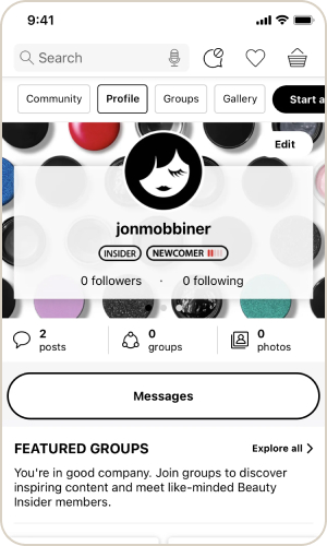
- Sephora: A community to share tips, reviews and challenges, plus exclusive events.
- Strava: Workouts turned into shared stories others can follow.
- For Gear Locker: Saved for later: community comes once ownership is proven.
Also reviewed: Peloton, Tesla and Nike.
03Exploration
We started wide.
With the team we mapped flows, sketched layouts and explored three visual directions. The ideas went far: sticker packs, ambassador lockers, an adventure log, a full immersive YETI world. Then we sorted every idea by one question: does it help us prove that owners value registering their gear?
Everything we put on the table
Legend: black pill = In the MVP · outlined pill = Saved for later
Utility
Rewards
Community
Content
(bold = In the MVP)
04Key decision
Balance ambition with feasibility.
Our hypothesis was simple and risky: would people find real value in registering their products online? An over-designed experience would have delayed the answer. So we scoped an MVP to validate product registration as a core behavior first, and only then layer engagement on top.
The experience grows with ownership
The MVP covers the first two steps.
01
Awareness · Register · MVP
02
Use · Collect · MVP
03
Engage · Plan ahead · Next
05The experience
Four pieces, one loop.
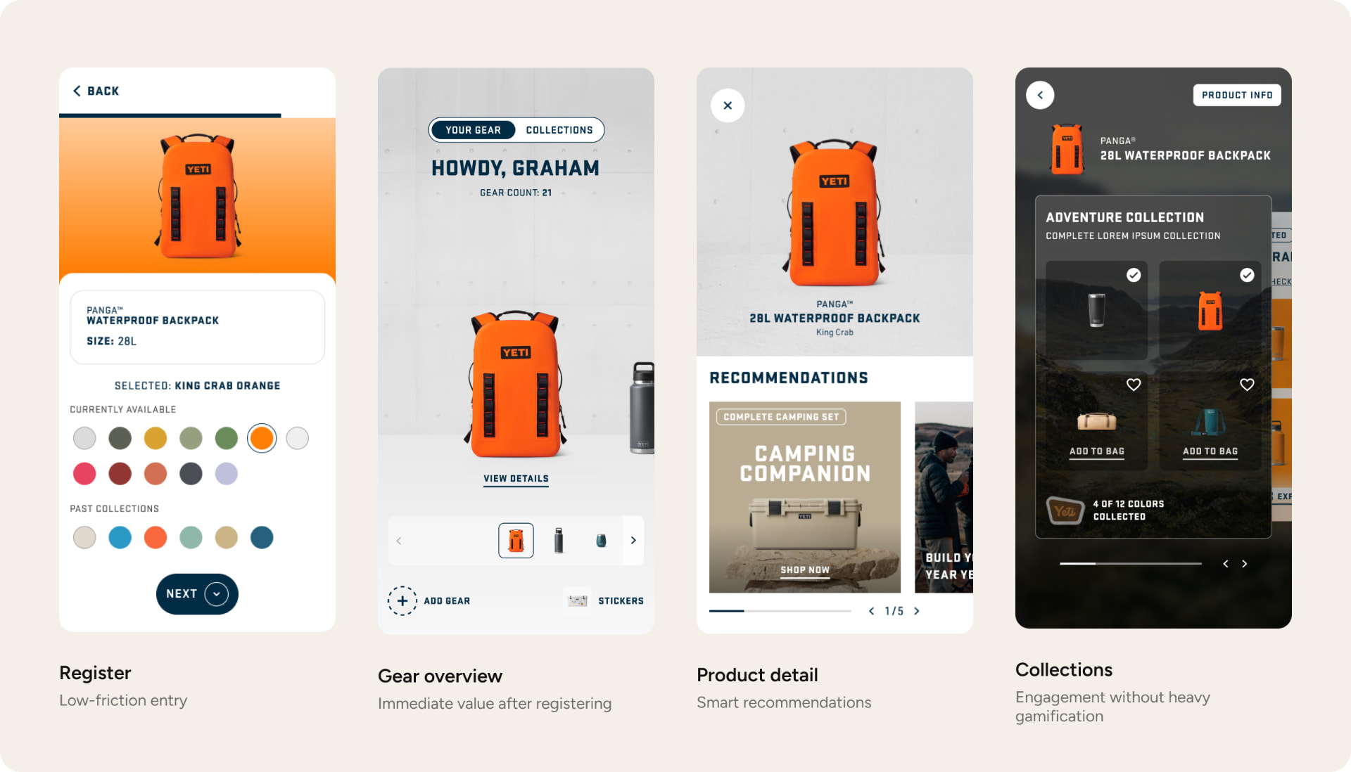
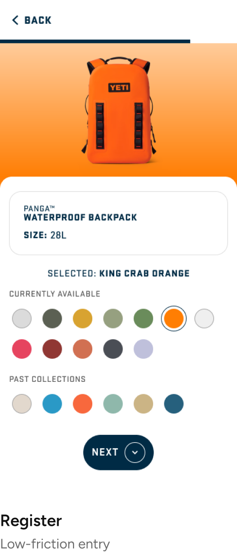
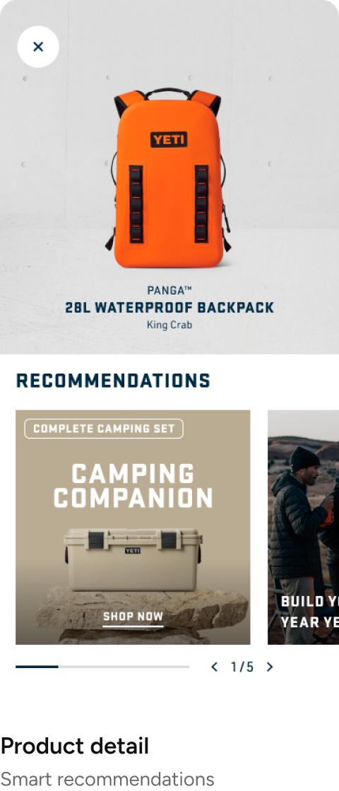
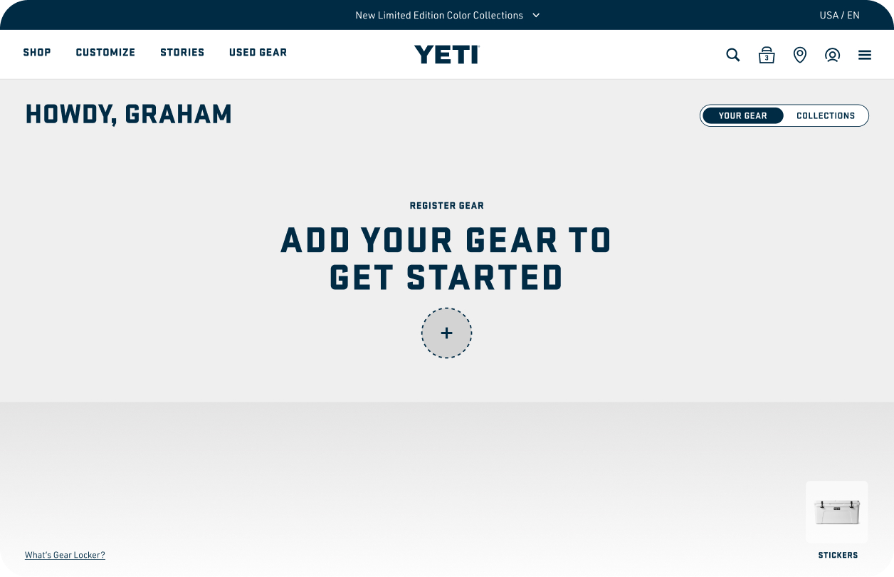
Each screen had a single job: get the product in, show value right away, and give a reason to come back.
Registration flow
Three ways in, one finish line.
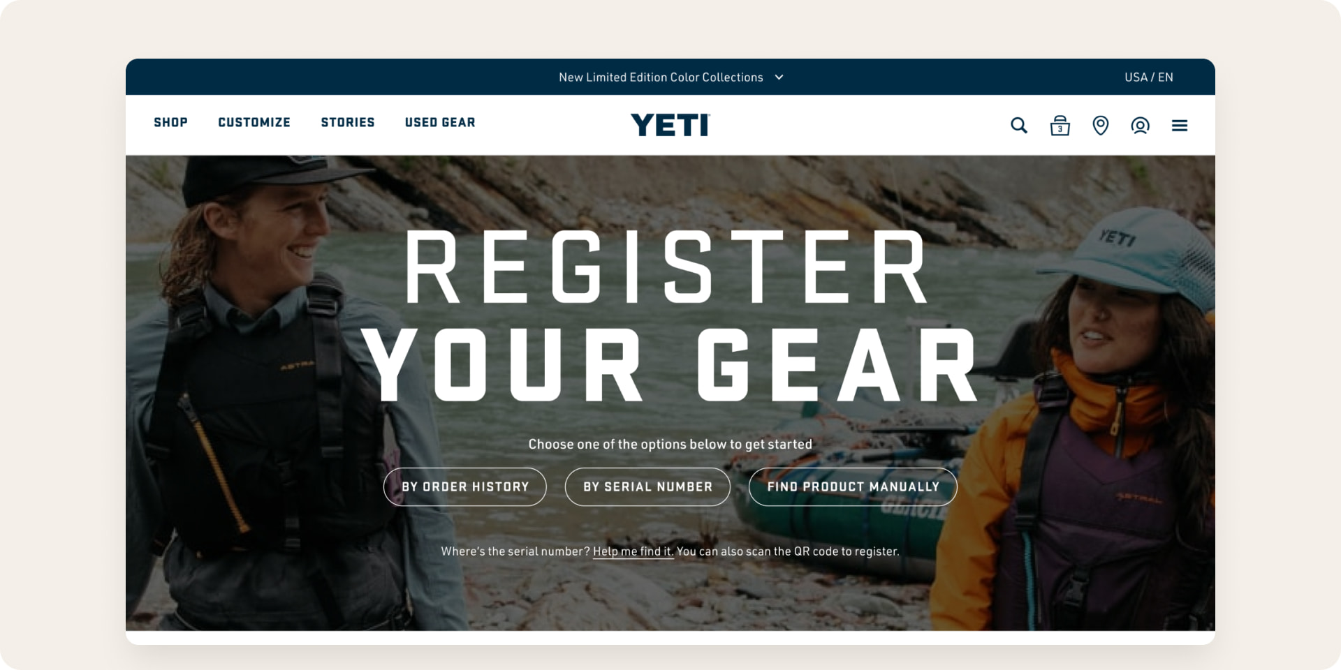
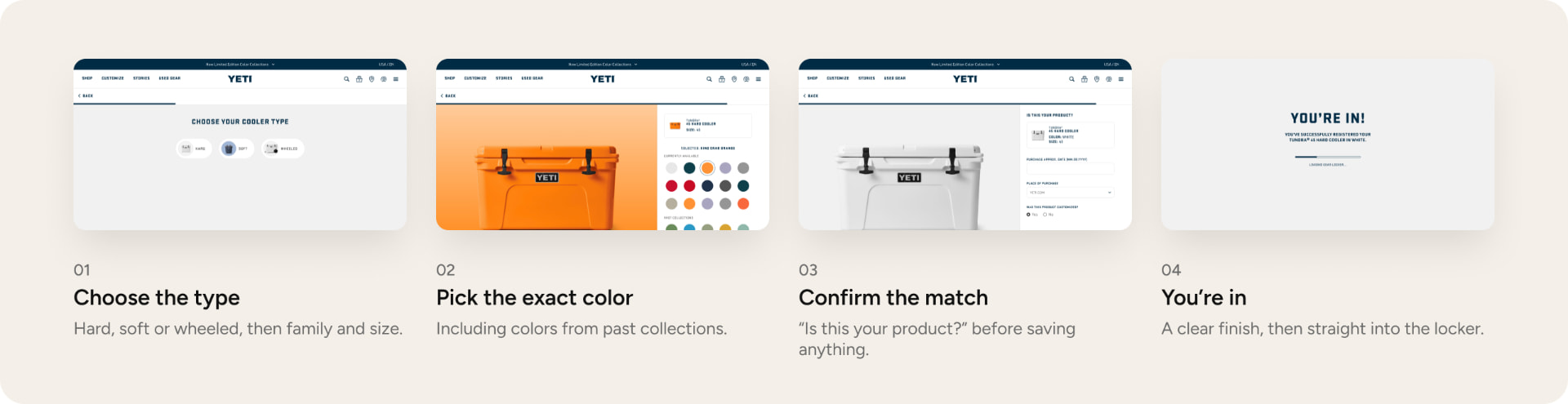
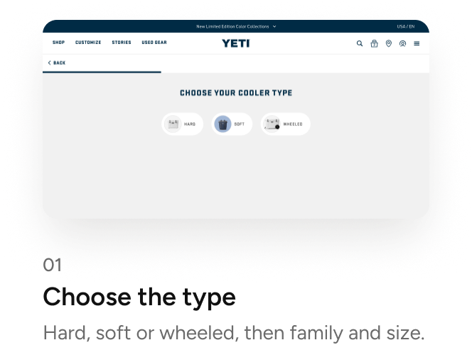
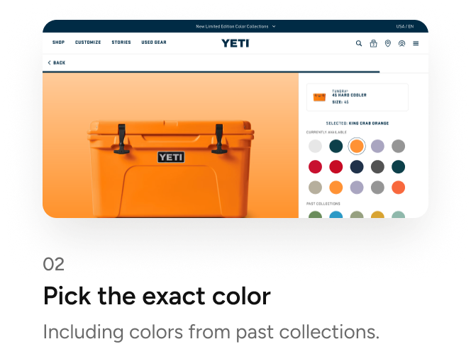
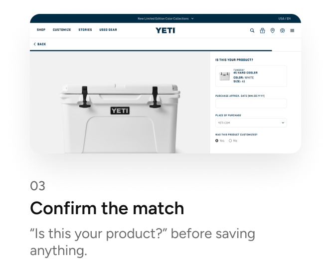
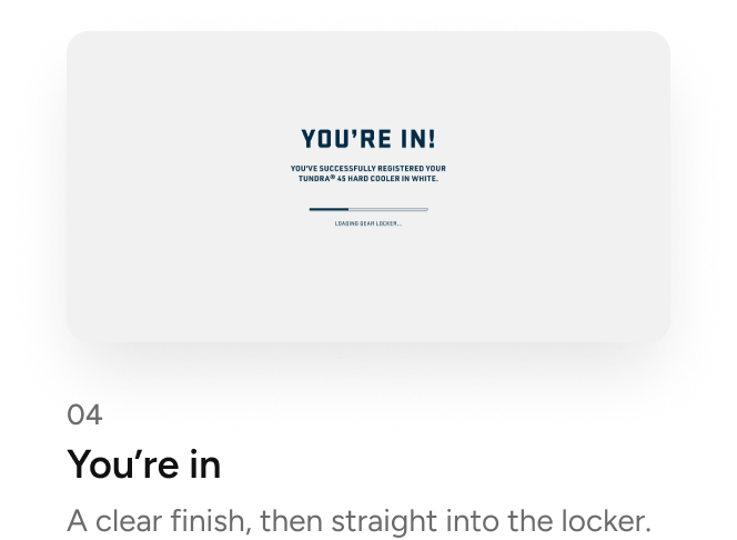
Registration was the behavior we needed to validate, so it had to work for everyone, including people who don’t know where their product came from. It starts with three paths: from order history, by serial number, or finding the product manually. From there the flow narrows one decision at a time, confirms the match, asks a few optional details, and lands you in your locker.
Designed for the messy cases too
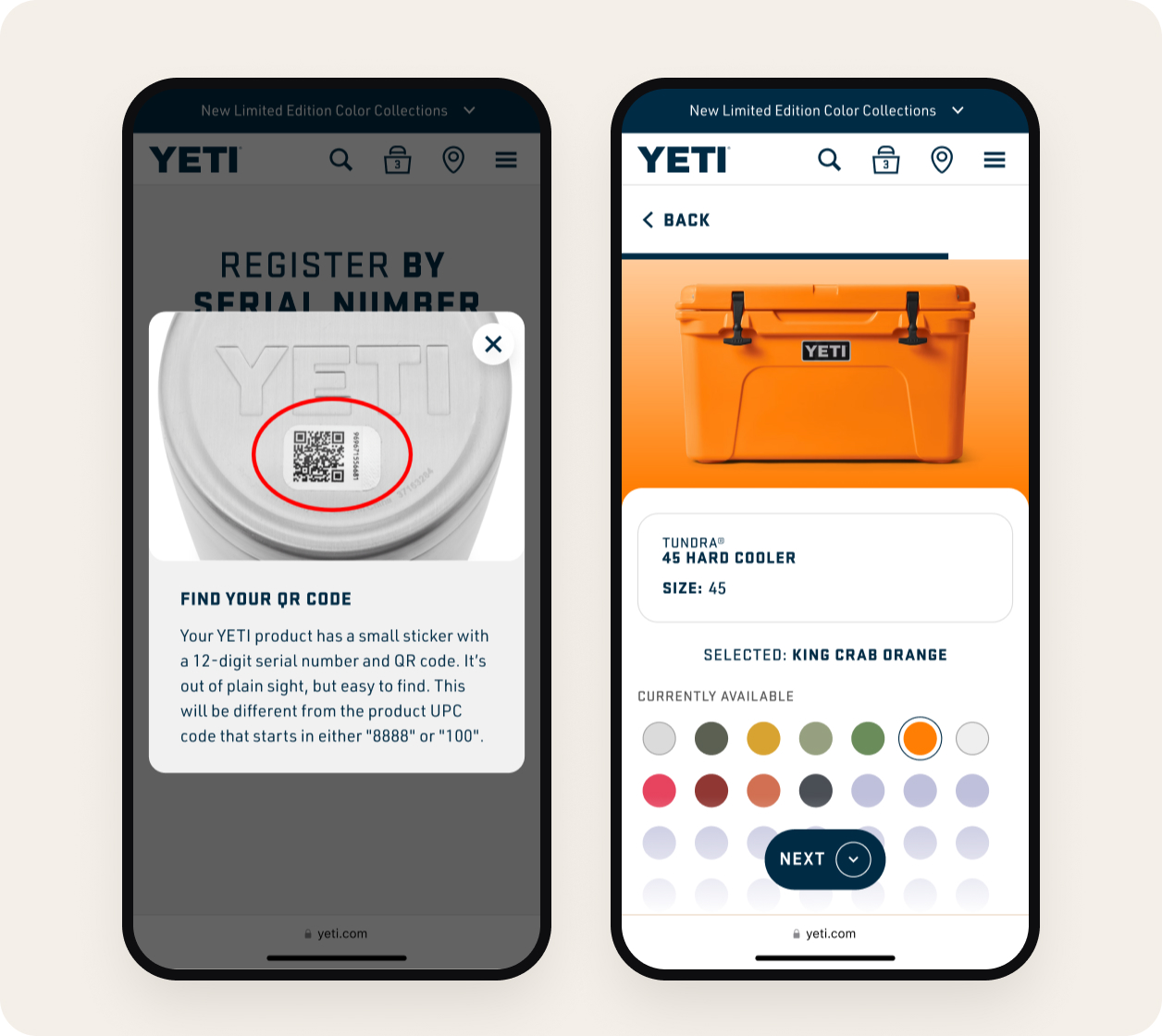
- “Help me find my serial number”, or scan the QR code instead.
- Order history with nothing in it.
- Registering several products at once from past orders.
- Already have an account? A gentle prompt to sign in.
- Mobile details stay optional: purchase date, place of purchase, “was this a gift?” and what you use it for.
Registering, made personal
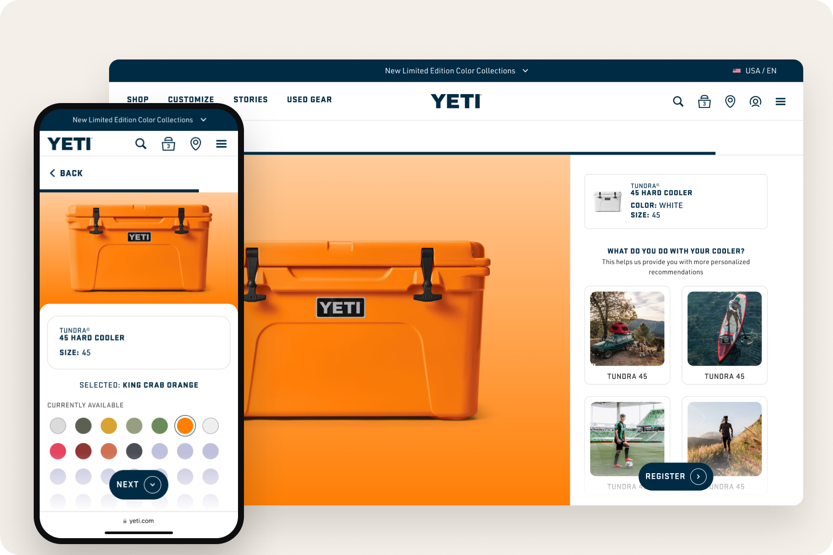
For owners: pick the product, choose your exact color (even from past collections) and tell us what you use it for.
For YETI: every step gathers real information about what people own and how they use it.
Accessibility, built into the spec
- Every color swatch has an accessible name, like “King Crab Orange”, not just a dot.
- Screen reader announcements for dynamic updates, like a selection or a newly added product.
- A static version of every animation for people who prefer reduced motion.
06Impact
A foundation, not a feature.
The MVP gave owners one place for their products, warranty and care, and gave YETI something it never had: a reliable dataset about who owns what. Instead of chasing vanity metrics, we defined success around the behavior we needed to prove, so the next phases (rewards, community) could be built on evidence, not assumptions.
Adoption
Number of products registered
Validates the core behavior
Engagement
Return visits to Gear Locker
Collections completed
Proves value beyond a one-time action
Data quality
Completed product information
A foundation for future features
What I learned